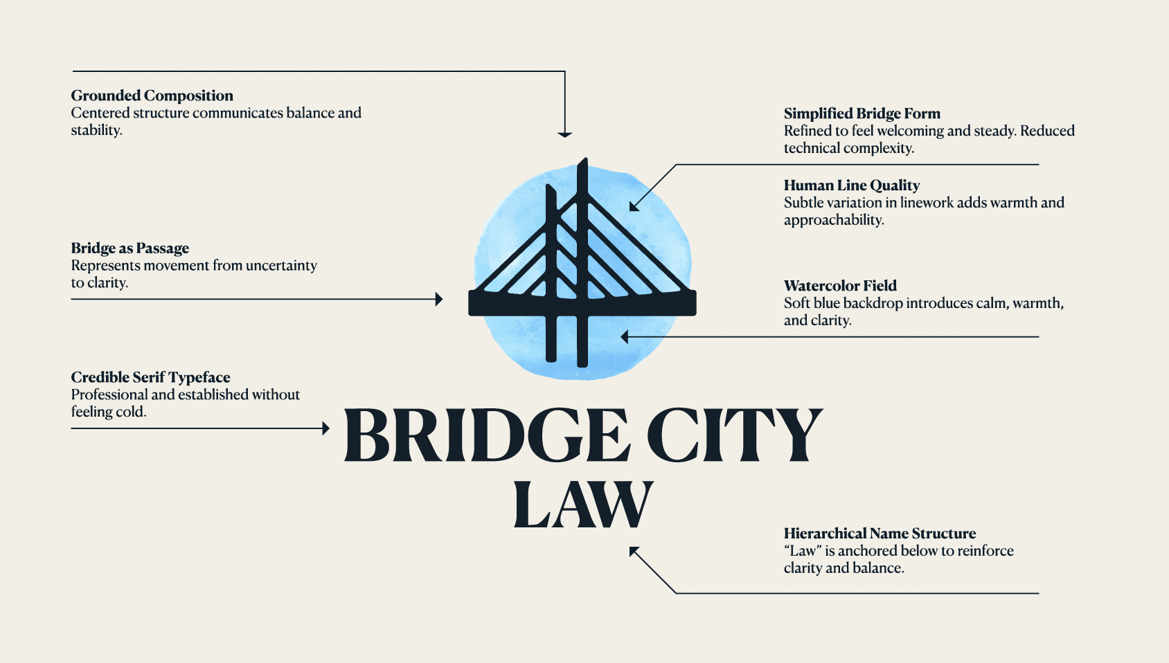
Logo Design
The Bridge City Law logo is designed to reflect clarity, stability, and approachability. Each element works together to create a mark that feels both professional and human. They balance structure with warmth.
The result is a clear and confident identity that reinforces the firm’s role as steady guidance during uncertain moments.
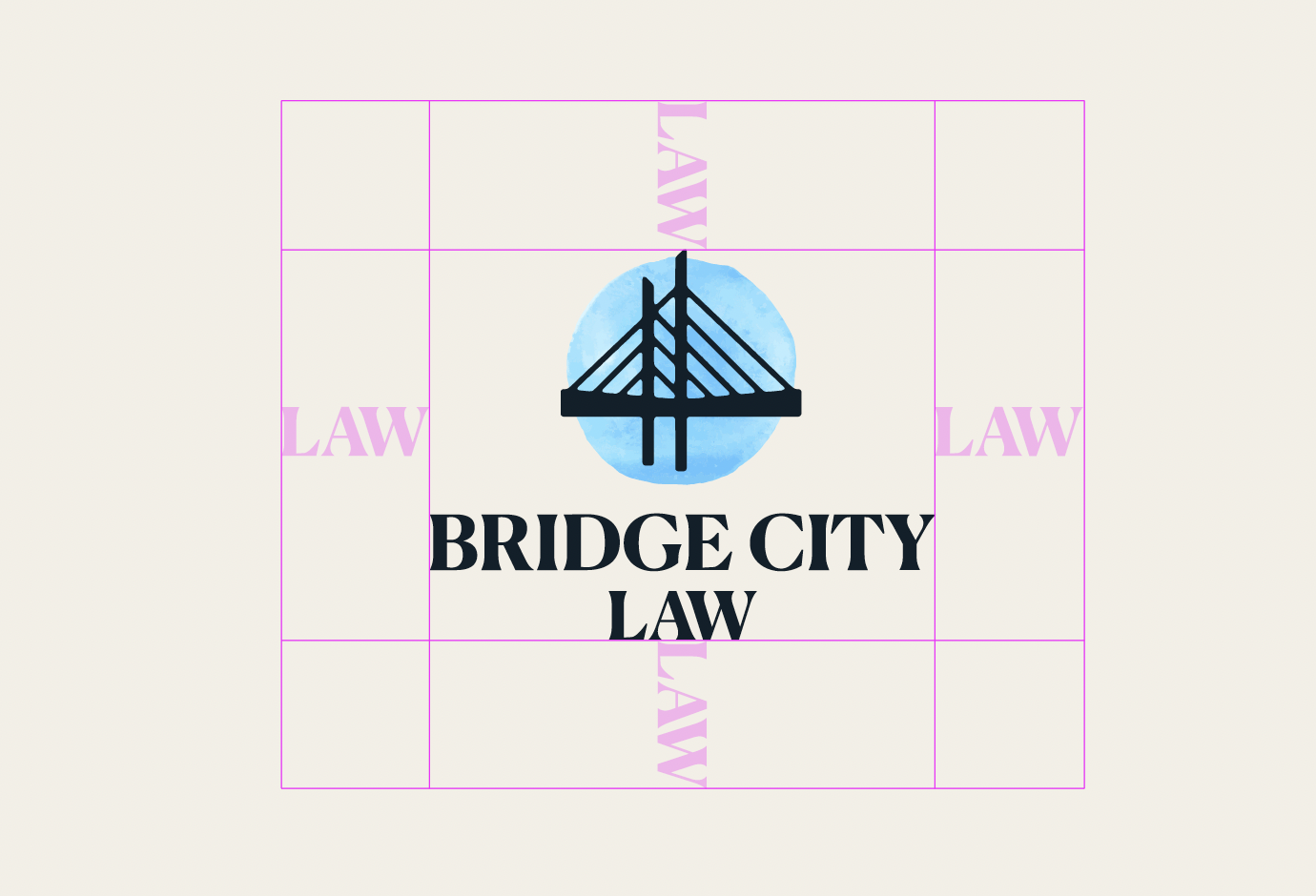
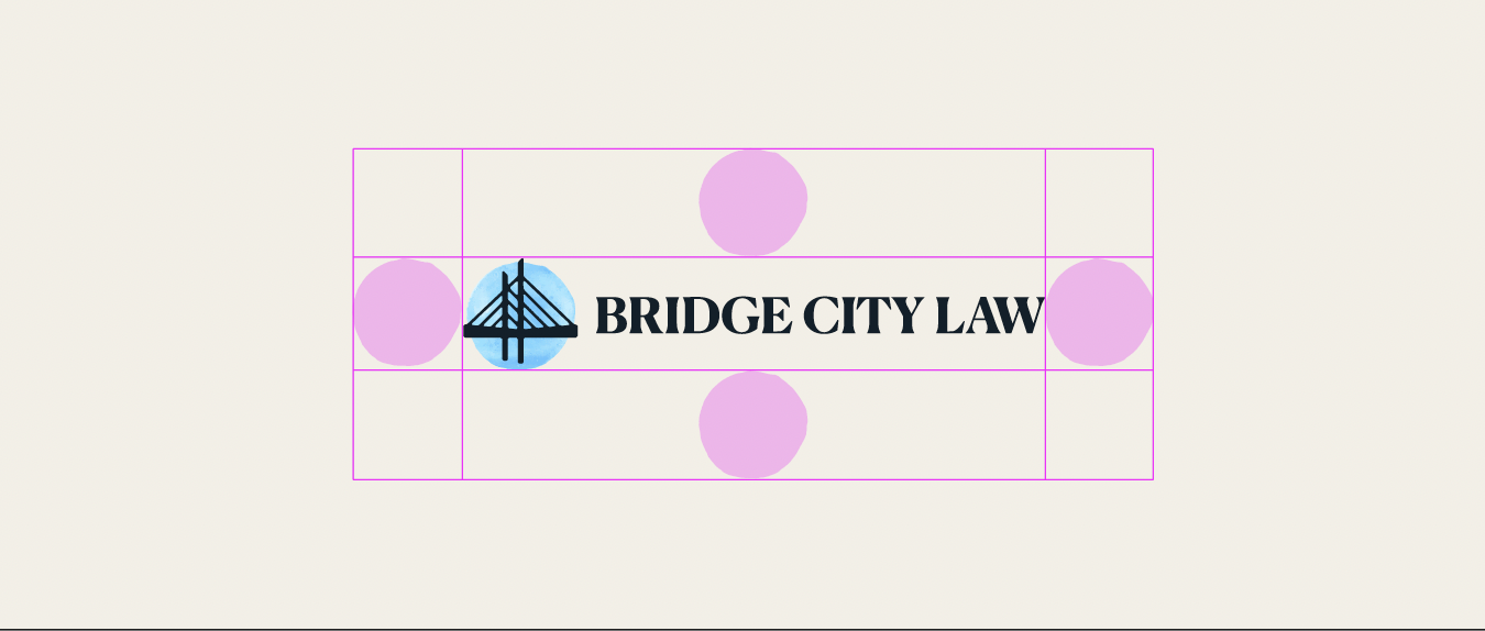
Clear Space
Maintaining clear space around the logo ensures it remains visible, legible, and effective across all applications.
Avoid placing other graphic elements (such as text, images, or patterns) too close to the logo.
As a general rule, clear space should be equal to the height of the “LAW” letterforms on all sides of the logo. For horizontal lockups, use the circle element as a spatial reference.
In limited cases (such as small-scale or constrained digital formats), use discretion while prioritizing legibility and clarity.